A simple analysis of a school's Std. XII results
Every year, the H.S.C. results are declared in June. The H.S.C. exams are the second public examinations for the students of Maharashtra, India. After this exam, the students apply for an undergraduate degree in various disciplines at different universities. Therefore, these exams hold tremendous importance for students aspiring to undertake a professional career.
One of the local schools in our city felt that
they needed a little more information about where
and how their students performed (unexpectedly
poorly) in the recently concluded exams. It seems
most of the poor peforming students were reluctant
to offer their feedback on the matter. So the
school authorities thought that perhaps a simple
data analysis would provide some ideas and asked
us to assist.
The first hurdle we encountered was that the exam
result information of hundreds of students was in
hardcopy (i.e. on paper). On enquiry, we were told
that the Examination Board did not offer a
softcopy version of the results. We were astounded
and groaned at the prospect of typing in all that
data for nearly 850 students. Luckily we came to
know that an individual student
could query
for his/her result from the website of the
Examination Board's site provided they entered
their exam roll number and their mother's
name. Armed with the list of such information for
all of the school's students, we wrote a script
that in a few minutes scraped the website and
obtained in a spreadsheet the results of most of
the students. (For a few students, the website did
not provide the result information and instead
asked the student to contact the school
directly. For such students we had to obtain that
information that from hardcopy).
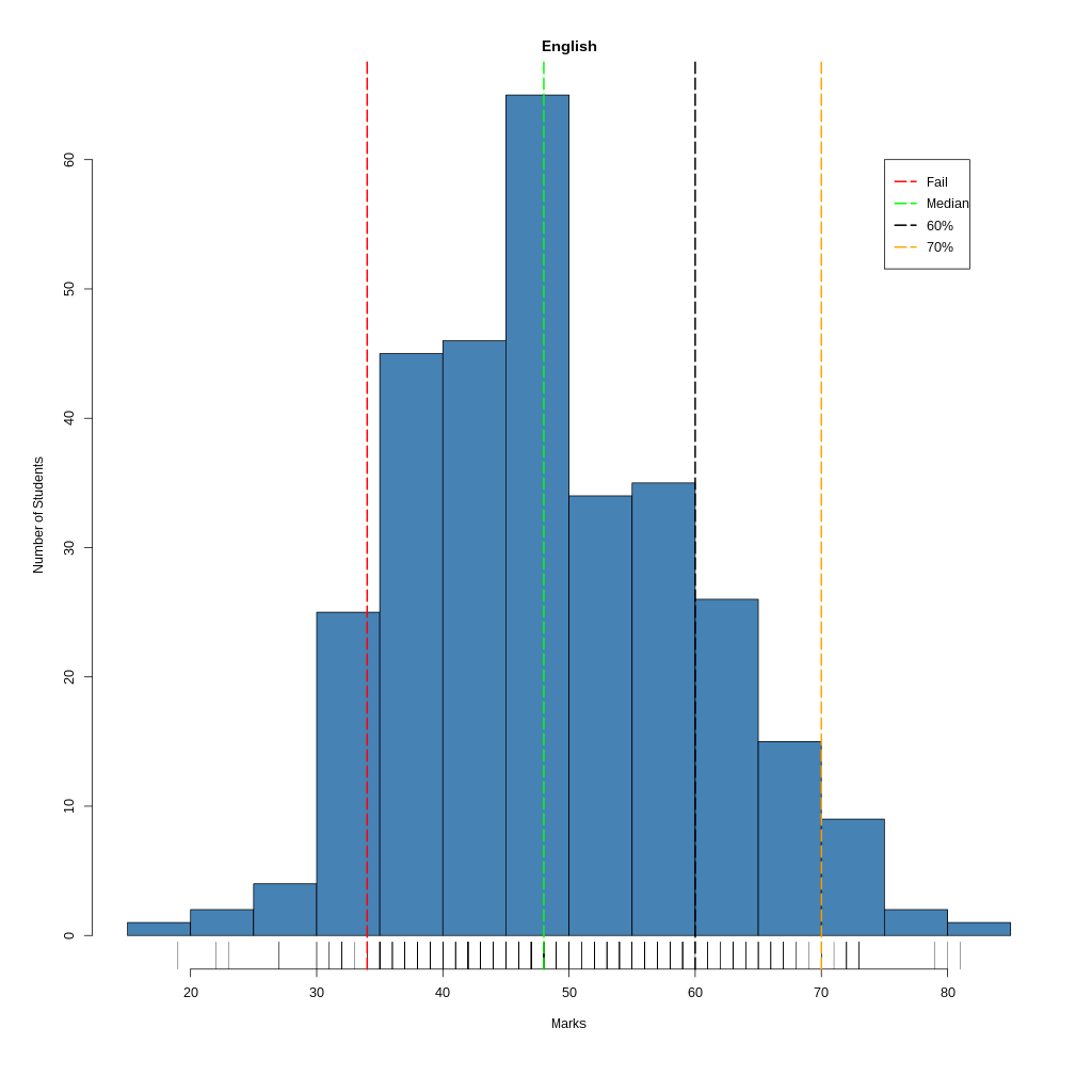
Our first stop was the humble statistic -
Histogram such as the one above. A series of
such graphs for each subject and for the grand
total gave insight into the students'
variations across different subjects. We also
plotted the median and other markers to help
the school authorities understand the relative
performance of the different groups of
students in different bands. (The range of the
bands were provided by the school.) We noted
that most of the graphs were following a
nearly normal distribution (Bell curve) and in
a couple of instances had bimodal
distribution. However, the spread varied quite
a bit from subject to subject.
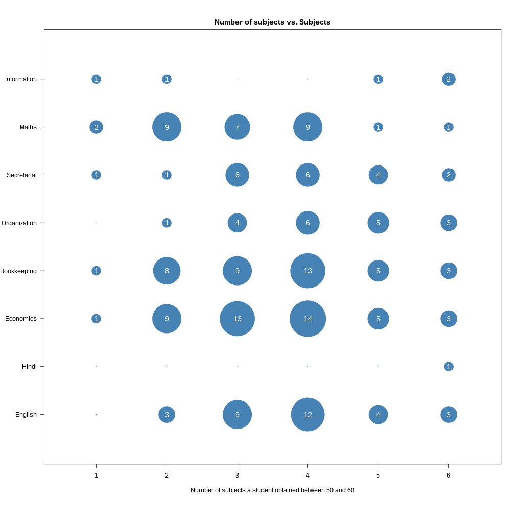
Since visual information is
intuitively easier to grasp, we
thought a figure instead of a table to
represent some of the information
might be quite useful. So for one of
the pieces of information viz. how
many students performed in a certain
manner in how many subjects, we
created a figure as shown
above. Indeed we saw a pattern more
easily (based on the size of the
circles) and pointed it out to the
school teachers who were quite
surprised by at least one of the
subject's appearance. More importantly
perhaps it gave them a clue as to
where they ought to be focusing their
efforts since not all subjects require
the same effort for the same result.
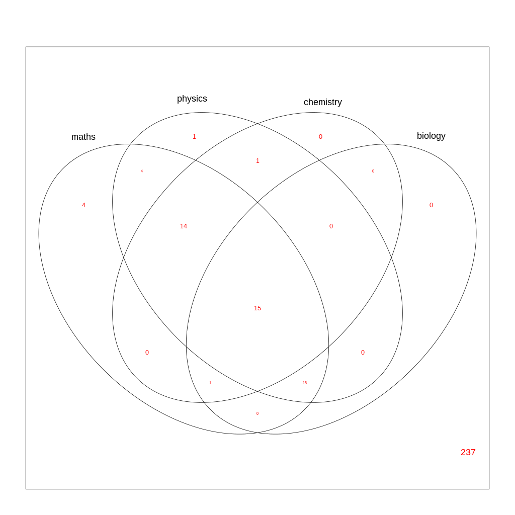
A few school teachers were also
curious as to how many science
students scored in a particular range
for four of the main subjects. For
example, how many obtained between
50-60 in maths but obtained more than
60 in Physics, Chemistry and
Biology. For this, once again, instead
of a table, We thought a more generic
figure such as a Venn diagram might
provide the required information as
well as answer related
questions. Although a little difficult
to read when you have more sets of
data, this representation is
definitely more compact and quick to
further interpretation.
Histograms
Is there any pattern in the poor performance?
Overlap through Venn Diagrams
Conclusion
We made a presentation to the school showing
those areas of the students' poor performance
and the patterns in their results. Besides the
graphs and charts, we also had a bunch of
numerical data to understand the contexts
better. Based on the analyses, the school
staff is now going to change their strategy to
improve future exam performance.